Project: Taubman’s Paint Project
Project: Taubman’s Paint Project
#UX #UI #B2C #PAINT #APP #COLOUR
From Overwhelmed to Empowered: Simplifying the Paint Journey at Bunnings
Discover how we helped Taubman take on Dulux by reimagining the in-store experience with an innovative app that simplifies the colour and paint selection journey and inspires shoppers.
Role:
UX/UI designer for end-to-end delivery of Taubman’s in-store app.
Key Deliverables:
UX discovery, competitor analysis, information architecture, wireframing & high-fidelity UI mockups.
Date & Duration:
2023/2024 - 4 months in total
Tools used:
Figma
Teammates:
Project Manager, Creative Director, Content Writer and Developer
The Challenge
The challenge for Taubman’s within the non-professional group and within the Bunnings channel is getting them to choose Taubman’s once in-store. The findings showed shoppers were choosing Dulux. Taubman’s 2023 goal for the Bunnings channel was to be a strong challenger in the market with out-of-the-box execution.
In-store, the colour walls across all brands looked nearly identical, making it difficult for Taubman’s to differentiate. So, the challenge is how can Taubman’s stand out from their competitors.
The Goal
Objectives:
Streamline the in-store consumer journey.
Simplify the colour selection process for non-professional users.
Business drivers:
Establish Taubman’s as a strong challenger in the Bunnings channel with innovative and unique execution.
Uncovering the insights
Through desk research, several helpful insights emerged:
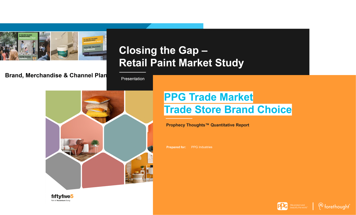
Sales Channel Importance: The Bunnings channel accounts for 80-85% of overall retail sales under the PPG portfolio.
Consumer Sentiment: A survey of 3,035 Australians revealed that non-professionals often find the range of paint products overwhelming and seek advice. While price influences decisions, they also perceive differences in brand quality.
Non-Professional Drivers: Price drives this group to stores, while brand reputation is less critical.
How do the colour walls currently look?
Taubman colour wall
Features:
Paint swatches
Colour scheme combination wall
Sheen levels
QR code for tips, tricks and inspiration
Brochures
COLORBOND® paint swatches
Coloursmith - create your own paint reader and ipad
Product ad
Dulux colour wall
Features:
Interior & Exterior paint swatches
Most popular colours section
COLORBOND® paint swatches
Dulux help & Advice number
Brochures
Product ad
British Paint colour wall
Key website features:
Paint swatches
Popular colours section
COLORBOND® paint swatches
Sample pot QR code section
‘How to prep’, ‘Shopping list’ & ‘About our products’ information sheet
Website
‘Meet our products’ section
Brochures
Product ad
Takeaway: When analysing the colour walls at Bunnings, it’s evident that they all share a similar appearance and feature set. However, Taubman’s stands out with its unique addition of an iPad display, a feature none of its competitors offer. The iPad not only differentiates Taubman’s but also physically protrudes from the wall, naturally drawing attention and provoking customer curiosity with its interactive presence.
Key Insight:
Jesse needs confidence, clarity, and step-by-step guidance throughout the painting process, especially in selecting colours and tools.
Mary & Peter prioritise simplicity, cost-effectiveness, and efficiency, with less need for creative guidance but a focus on practicality.
Updating our objective:
After deeper discovery and persona refinement, the objective became more focused:
Design an interactive app experience that guides and inspires users through their paint and colour journey while providing tools for efficient and cost-effective decisions.
Ideation workshop
To spark creativity, we hosted a collaborative workshop with cross-functional teams and stakeholders. We started with "How Might We" questions to generate diverse ideas and foster an open, exploratory mindset.
Impact vs effort matrix
Ideas were evaluated using an Impact vs Effort matrix to prioritise solutions that would provide the highest user and business value while aligning with available resources and timelines.
Designing the Framework
Building on user insights and stakeholder collaboration, we created a simple, intuitive and accessible information architecture to support Phase 1.
These 3 main pillars link back to the problem we’re trying to solve:
Simplifying Color Selection: Popular Colours & Colour Forecast
Inspiring newbies: Inspiration by project
Streamlining Paint Decisions: Paint Comparison* & Paint Calculator
(*Note: Paint Comparison was postponed due to budget & time constraints.)
Applying UX laws and
best practices for tablets
We applied UX laws and best practices to optimise the app for tablets, focusing on:
Larger buttons and interface elements for easy touch.
Minimal scrolling to improve usability and recall.
Clear text hierarchy for a visually guided experience.
Touch-friendly targets for accuracy.
Sketch & Digital wireframes
With the structure finalised, initial ideas were sketched and converted into digital wireframes for client feedback. Iterative stakeholder collaboration ensured alignment, though some features were deferred to Phase 2 due to budget and time constraints.
The High-Fidelity Vision
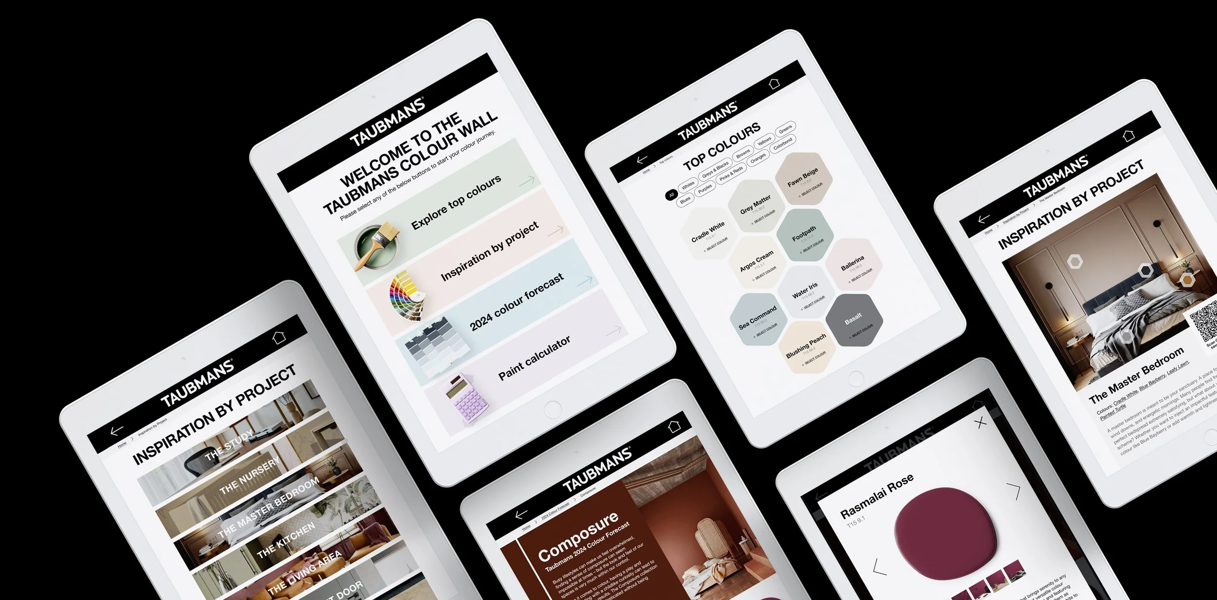
Our primary focus for the UI design was to ensure simplicity, clarity, and ease of touch and navigation while incorporating colours and inspiring visuals to engage users and spark creativity. Maintaining consistency with the Taubman’s brand, we aligned the design with their existing website to create a seamless and familiar experience.
Key Features:
Intuitive Navigation: We implemented multiple navigation options to enhance usability, including a home button, a clickable logo (acting as a home button), a back button, breadcrumbs, and project-specific "Previous" and "Next" buttons. These features empower users to move through the app effortlessly.
Saving Paint Colors: Users can save their chosen paint colours using integrated QR codes, enabling them to quickly retrieve the information for future reference.
Paint Calculator: To simplify the next step, users can calculate the exact amount of paint needed for their space after selecting a colour, streamlining their journey from inspiration to purchase.
Launching the App:
Testing in the Real World
With the designs finalised and development complete, we brought the app to life by launching it in a single Bunnings store as part of Phase 1. This pilot phase allowed us to observe the app in action within a real-world setting, gathering valuable feedback from users and store staff. By focusing on one location, we could closely monitor interactions, identify any pain points, and measure the app’s impact on customer engagement and decision-making. This phased approach ensured we had a solid foundation before scaling the app to additional stores.
Measuring the Impact:
3 Months In
Three months after going live, these early results highlight the app’s effectiveness in engaging users:
1.7k sessions were recorded in the first three months.
21:36 average session duration, indicating strong user engagement.
1:43 average time spent per page, showing users are taking their time exploring content.
12.6 pages per session, demonstrating deep exploration of the app.
11% bounce rate, reflecting a low number of users leaving after just one page.
98.5% average scroll depth, highlighting thorough content consumption.
0 rage clicks, confirming a smooth and frustration-free user experience.
Top-clicked features: White, Greys & Blacks, Select Colour, and Greens buttons, showing popular user preferences.
After finishing off the phase 1 milestone, I have road-mapped the next steps:
User Feedback Collection: Conduct in-store and online surveys and interviews to gather qualitative insights on user experiences and areas for improvement.
Analytics Deep Dive: Analyse user behaviour data to identify trends, optimize navigation, and refine underutilised features or pages.
Feature Enhancements: Explore adding features like paint comparison, paint project tutorials, or a product quiz.
Expand Rollout: Gradually implement the app across additional Bunnings stores, using feedback from the initial store to refine and improve the app.
Ongoing Testing: Perform A/B testing to evaluate different design or feature iterations to continually improve user engagement and satisfaction.
What Went Well
Seamless Collaboration: The open-minded and collaborative approach of stakeholders and the cross-functional team contributed to a highly effective working dynamic.
Learning Opportunity: I gained valuable insights into designing best practices for tablets to ensure an optimised user experience, as well as designing for an in-store B2C experience.
What Could Be Improved
User Testing: Due to time and budget constraints, we were unable to conduct user testing before launching the app, which limited our ability to gather early feedback.
Project Pauses: The project faced a several-month hiatus, during which a new project manager was brought on board. This transition disrupted the continuity of the process, resulting in some gaps in information and delays. More thorough and detailed documentation could have mitigated these challenges.
Say hello!
I am always keen to collaborate, to make new connections or just a good old chinwag.


