Project: JB Hi-Fi Business
Project: JB Hi-Fi Business
#UX #UI #B2B #TECH #ECOMMERCE
How do you transform an Australian consumer electronics giant into a trusted B2B solution provider?
That was the challenge we faced in redesigning the
JB Hi-Fi Business website. The outcome was launching a cohesive integrated information and e-commerce platform, boosting customer signups by 92%.
Role:
UX/UI designer for end-to-end delivery of the JB-Hi Business information and e-commerce website.
Key Deliverables:
UX Research and discovery, competitor analysis, analytic analysis, creating user personas and user journeys, card sorting, sitemap creation, low-fidelity wireframing & high-fidelity UI mockups on information and e-commerce website, usability testing, and design systems.
Date & Duration:
2022 - 10months
Tools used:
Figma, XD & Loop 11, Mural, Illustrator, Photoshop, InDesign
Teammates:
Account Director, Project manager, Strategist, Creative Director,
Head of Digital Experience, Content writer, Junior designer and
Developer (external agency)
The Challenge
JB Hi-Fi Business had struggled to establish a strong presence in the B2B market. Business customers were purchasing as consumers, not as buyers of B2B solutions.
The website had a disconnected journey from the information site to the e-commerce site and the distinct user segments did not address their different needs and goals.
What can we uncover through research?
Research Insights revealed the following user sentiments:
The JB Hi-Fi Business brand is an unknown so the retail brand is a point of trust.
Investing in penetrating market segments represents the best opportunity.
- Education: Focus on growing education K-12.
- Business - Professional Services: Target professional small to medium professional service enterprises in all States.When it comes to buying ICT products and services, customers have different mindsets. There is a big opportunity to focus and grow the following segments:
- Novice Buyer Mindset (no strategy, device focused, scrambling)
- Entrepreneurial Buyer Mindset (business strategy, not technology, focused, ambitious)
Officeworks
Officeworks is well-positioned to serve Australian SMBs with its extensive range of office supplies, technology and educational products, and business services. Their Business hub solutions allow users to sign up to a business account.
Key website features:
Integrated into the retail store (Bulk Buy Hub)
The business hub is hard to find
Featured case studies demonstrating credibility
Easy purchasing journey
How does the JB Hi-Fi Business experience stack up to others in market in right now?
Harvey Norman Business
Harvey Norman Business has a solid presence in the B2B market, but its dated website and limited product visibility on the business platform undermine its overall offering and customer experience.
Key website features:
Separate B2B website
Why us page
Book a meeting CTA which allows users to quickly have a 1:1 with HNB
List of all industries
FAQ page
Difficult purchasing journey
Best Buys
Although in the American market, Best Buy Business has a unique position in the B2B market by offering a wide range of consumer electronics alongside specialised business products. Their in-store consultation and installation services provide an edge.
Key website features:
Integrated into the retail store
Many case studies demonstrate credibility
Call to actions include: Sign up for a free account, Connect with us, Chat with an Account Manager
Engaging videos for most industries
Takeaway: We have the opportunity to leverage JB Hi-Fi’s strong reputation to build a seamless website that rivals the user experience offered by Officeworks and Best Buy using similar key features
Defining the Project Goal
Be front of mind for Business and Education segments when they need fit-for-purpose commercial products and services.
Effectively bring the B2B brand and positioning strategy into fruition on the website.
Enhance the user experience by boosting customer signups, increasing organic traffic and decreasing the bounce rate.
Project considerations:
Development was to be managed by an external company.
The internal team had already initiated the e-commerce portion of the project, which was handed over to us midway through the wireframing phase.
Empathy Through Research
From all the extensive research, workshops, surveys, stakeholder interviews conducted we were able to utilise all these insights to develop our three main personas for the Business and Education segments.
The focus was primarily on Small to Medium Businesses decision-makers who were product-focused, price-conscious, and needed to make quick purchasing decisions. As they didn’t have time to waste creating a seamless, fast, and intuitive experience was essential.
Below are the secondary personas.
Key Insight: The same people who made consumer purchases at JB Hi-Fi were also technology
decision-makers at SMB and Enterprise organisations. This shaped how we approached product
integration, structured the information architecture, user account creation, and product findability.
Card Sorting for Clarity
To tackle the challenge of structuring the site, we conducted a card-sorting exercise. This provided invaluable insights into how business customers thought about categories and priorities, guiding us to build an intuitive navigation structure that addressed the distinct needs of our personas.
Addressing the two user segments
We knew the success of the JB Hi-Fi Business website depended on addressing the distinct needs of two user segments: Business and Education. Through multiple rounds of iteration and internal testing, we explored different ways to create clear paths for each group. We held stakeholder workshops to brainstorm solutions, considering options like separate websites, housing all content on one site, or using subdomains.
Outcome: Ultimately, by revisiting our user research, it became evident that the segments had very different goals. The best solution was to implement two subdomains within the same website, allowing us to meet the unique needs of each audience while maintaining a cohesive brand experience.
Information Architecture
Armed with these insights, we redesigned the site’s architecture with business and education segments at the forefront. We placed products prominently in the navigation and introduced a clear “Create an Account” feature to drive business sign-ups. Unfortunately, the product categorisation remained outside of our control, but our goal was to simplify navigation as much as possible.
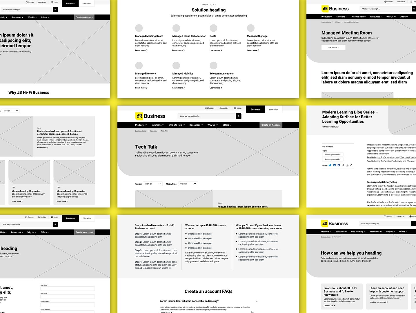
Digital Wireframes
We created versatile wireframes with modular components, allowing the external development team to build out the site efficiently while maintaining design integrity. The focus was on ease of use and seamless navigation, ensuring the user journey was optimised for business buyers.
Cross-Functional Feedback: I presented draft designs to my team and stakeholders for critique. This was a collaborative process where we could identify potential issues early, refine the designs, and ensure they aligned with the technical capabilities of the external development team.
Designing a Seamless Switch Between Sub-Domains
One of our key challenges was designing an intuitive way for users to switch between the Business and Education sub-domains. We ideated various solutions, building prototypes to test with both business and education customers and internal teams.
Feedback: Majority of participants found the toggle design the most straightforward and easy to navigate, confirming it was the best approach.
High-fidelity prototype
The design phase involved implementing and creating the JB Hi-Fi Business’s new visual language. Balancing the limited yet dominant colour palette was a challenge, but by integrating illustrations, photography, and secondary colours, I achieved a visually engaging and functional UI.
Usability Testing
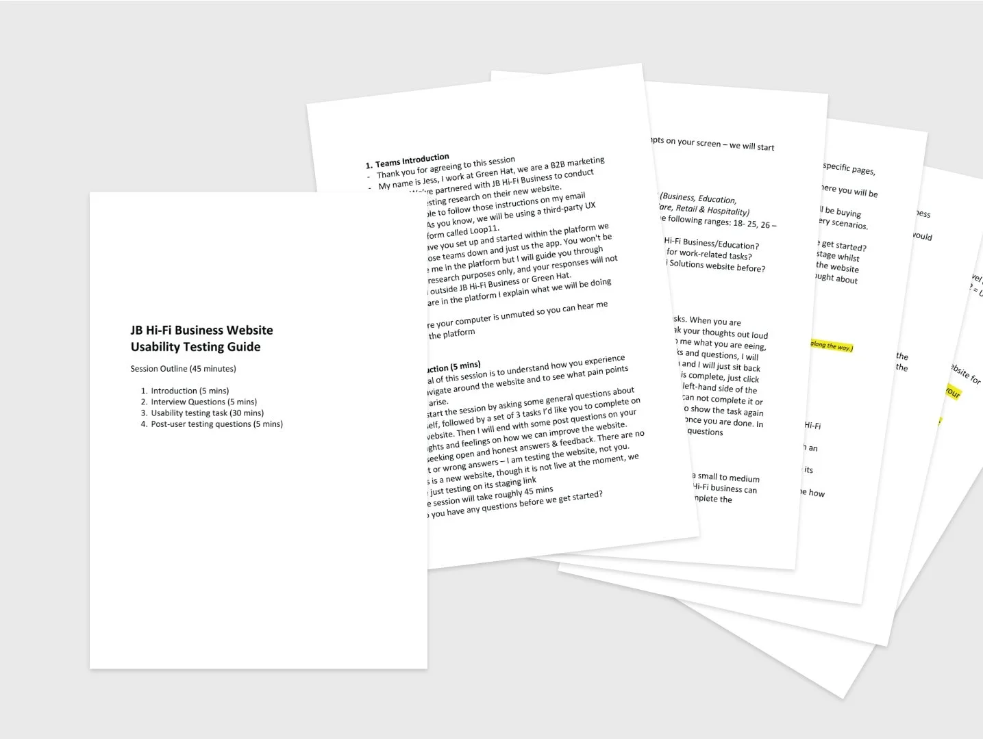
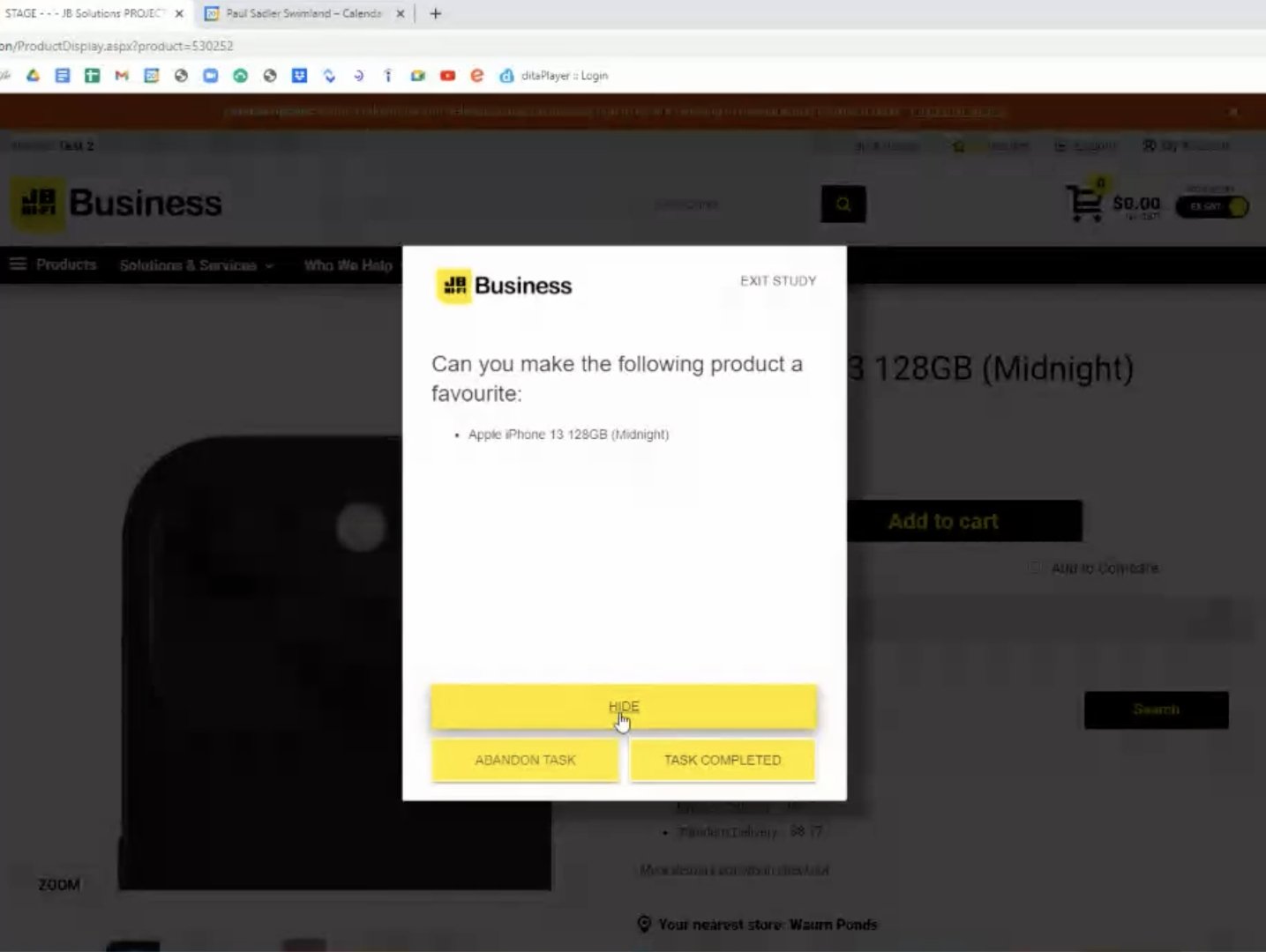
I conducted usability testing on the staging link to assess how easy it was for users to complete core tasks in the design such as creating an account, purchasing a product and toggling between domains. Test results were analysed and insights were used to iterate on the designs.
Study type: Combination of moderated and unmoderated testing using the Loop11 platform
Location: Australia wide | Remote
Participants: 10
Length: 45mins


Affinity diagramming
I organised the findings from usability testing using affinity diagrams. Grouping the insights into themes helped me quickly identify the most pressing issues and iterate on the design accordingly.
The testing process revealed some wins, such as the success of the toggle design and layout, but also uncovered pain points around product findability.
Finalising the design
Designs were iterated to address the pain points that came up in testing before the site was launched.
Design system
I developed a design system to ensure consistent brand representation across all digital assets. This particularly assisted with the handover to the external development team.
What Went Well
Invaluable experience in stakeholder alignment and cross-functional collaboration.
Conducting usability testing honed my ability to ask unbiased, open-ended questions on the fly.
Despite working with multiple teams (internal, client-side, and external development), we managed to stay aligned and focused on our common goal.
By staying adaptable and prioritizing user insights at each stage, we were able to create a cohesive, intuitive experience that not only met business goals but improved the overall user journey for JB Hi-Fi Business customers.
What Could Be Improved
Clarify technical constraints with external development team before kicking off design work to avoid technical limitation. In future projects, I would conduct more alignment workshops with developers from the outset to understand these limitations sooner.
More frequent testing, particularly in the e-commerce flow, would have helped us identify and resolve user friction earlier in the process.
Regular review check-ins with the development team during the build phase would ensure that the final product remained consistent with the UI designs.
Results: The feedback I received about the process and designs from the stakeholders were positive and they believed we effectively brought the B2B brand and positioning strategy to life on the website addressing segments.
We boosted customer signups from 130 per month (driven purely by sales) to an average of 250 per month (after a 6 month period).
Say hello!
I am always keen to collaborate, to make new connections or just a good old chinwag.


